5 Best CSS Frameworks for Front-end Developers
In the best CSS framework, you can think of it as a design or cover that is supported by HTML, the default structure of your website.
CSS has the advantage of being quick and simple to use, which is one of the reasons most web designers and developers use it.
The foundation of your website is HTML, but CSS adds elegance, design, and functionality to its front end. There is probably not a single website in the world that does not use some kind of framework.
With it, you can design a website efficiently and in the process, make it more functional, which in turn should help drive more traffic to your website and improve your rankings.
In addition to its ease of use, it continues to remain highly widespread with both developers and designers.
By using CSS on your website, you can automate most of the messy tasks, automate them and lend your website some much-needed stability in the process.
The fact that it is functional across all browsers is another reason why most designers choose it. Take a look at our list of the top 5 CSS frameworks for 2022.
Table Of Contents
What is a CSS Framework?
The CSS Framework is a collection of ready-to-use CSS libraries (Cascading Style Sheets). It simplifies the process of creating websites. A UI developer's job is made easier by the stylesheets collection.
CSS frameworks enable developers to quickly create user interfaces they can replicate throughout a project rather than initiating from scratch with every project. Creating standards-compliant websites is also made easier with them.
The descriptions and buzzwords on CSS framework sites can be complex or imprecise for amateurs, but they are very useful for experienced developers who know the terms.
Top 5 CSS Frameworks
When it comes to CSS frameworks, there are a lot of different options to choose from. If you're not sure which one would be best for you, never fear!
In this blog post, we'll go over five of the best CSS frameworks for front-end developers, so you can make an informed decision about which one is right for you and your project.
#1 Bootstrap
Bootstrap is a CSS framework that was initially designed as a tool for Twitter's internal teams, but has since evolved into one of the most prevalent in the world.
More than 2000 contributors have contributed to Bootstrap's GitHub repository, which has over 20,000 commits. Bootstrap is employed by about 22 percent of all websites.
The Node Package Manager (npm), Composer or Meteor are all prominent ways to get started with Bootstrap's source Sass and JavaScript files.
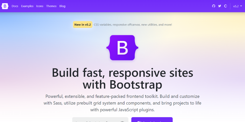
Check out any of the authorised norms, which are accompanied by comprehensive documentation, or initiate a Bootstrap project using the npm template repository.
The benefits of Bootstrap make it an excellent choice for anyone unfamiliar with CSS frameworks or who has only limited CSS experience.
In this case, back-end developers have the option of making changes to their project's User Interface (UI). With Bootstrap, designers can create alerts, tabs, forms, and dropdowns with templates for all of the most popular user interface components.
Furthermore, Bootstrap is designed to enable the development of responsive, mobile-first front-ends. As a result, it is well suited to mobile projects.
#2 Foundation
Foundation is a front-end framework for developing websites, applications, and emails. A responsive Foundation framework makes it easy to create projects quickly thanks to its SASS compiler.
In Foundation, the focus is on clean, semantic code and mobile-first development. Then you can add more complexity to create a fully-responsive design after your project has been made fully mobile-friendly.
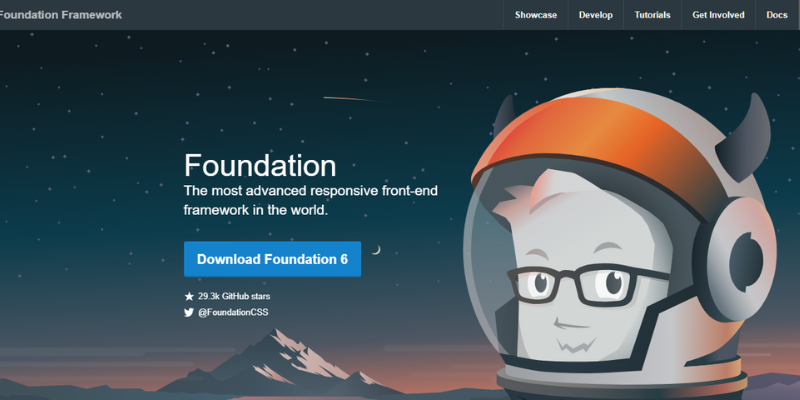
In addition to HTML, CSS, and JavaScript, Foundation provides a quick and easy way to prototype websites. Foundation provides tested email patterns that are compatible with all major email clients, including Outlook if you're using it to create emails.
When you create emails that display and function correctly, regardless of how recipients access them, you can reduce your chances of sending errors.
#3 Skeleton
Using Skeleton, you can quickly develop clean code and simple layouts using just a little set of CSS files. With fewer than 400 lines of code, this framework makes an excellent choice for smaller projects or those not requiring heavier functionality.
Skeleton comes with 12-column fluid grids with 960px maximum widths. Grid sizes are widely varied depending on browser and device. In either case, a single line of CSS can be used to modify the maximum width.
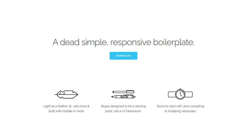
The underlying simplicity of Skeleton makes it a good choice for mobile apps since it doesn't add a lot of jargon to your project. As a mobile developer, Skeleton makes creating quality responsive layouts easy thanks to its well-structured grid.
Skeleton uses media queries to serve its scalable grid. As well as listing a number of mobile-first queries, it helps you style your project across multiple devices.
The enhancements are targeted for larger devices since all styles outside of queries apply to all devices. Streamlining CSS relieves small devices from having to parse disproportionate data.
#4 Bulma
The Bulma CSS framework is a responsive and modern CSS framework. There are several components to this framework, including HTML, SASS CSS prospector, and CSS flex-box.
By combining sass files, web packs, and variables, Bulma gives you a wide variety of customization options. The Bulma framework is constructed in pure CSS. In order to use Bulma successfully, you will only need one .css file and no .js files.
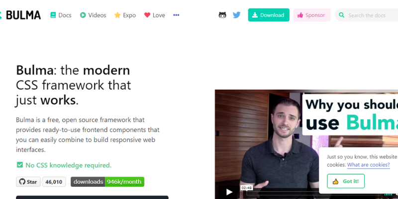
In addition to the high level of functionality, this framework has some features that can make your website more visually appealing and require less coding. By using the utility's functions, you can create dark and light colour patterns.
This framework utilises the exact grid system as Bootstrap. SASS modularity is supported by Bulma. As a result of the .icon element, it is integrated with both Font Awesome 4 and Font Awesome 5.
#5 Tailwind CSS
Employing Tailwind CSS, you can build bespoke designs without having to worry about annoying opinionated styles that you have to fight to override.
This low-level, utility CSS framework gives you all the tools needed to build bespoke designs. It does not come with predefined components, unlike other CSS frameworks (like Bootstrap).
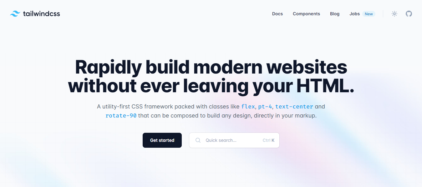
You can quickly create your own custom designs using Tailwind CSS's CSS helper classes, which operate at a lower level.
Conclusion: Make the right choice!
In order to build your web applications, you should choose a framework that offers a variety of features and components. The right CSS framework will make styling simple and time-saving, so you can focus on writing business logic instead of complicated styling.
Creating applications and websites from scratch can become repetitive very quickly. Instead of coding the same element repeatedly, you can save time and effort by using a CSS framework.
The CSS framework can be your greatest asset when it comes to building professionally-designed websites and applications in a short amount of time. In the end, you will still need somewhere to host your project once it's ready to launch.
Atatus: Real-time Monitoring
Atatus enable you to gain visibility into poorly performing parts of your website that negatively impact your end users through a scalable, end-user monitoring solution. Improve the user experience with a better understanding of your front-end performance errors.
Improve end-user performance by diagnosing the complex front-end issues arising from slow page load times, route changes, late static assets, poor XMLHttpRequest, and JS errors
In addition to Google's Core Web Vitals and Other Web Vitals, we gather critical performance data that helps you understand what's causing slow performance at the user level if they're experiencing slow loading times, sudden changes, or trouble interacting with the page.
Identify and solve front-end performance issues that are impacting real users with an in-depth view of every page-load event. Identify which assets are slowing down your pages using the detailed full resource waterfall view, which allows you to filter by URL, connection type (2G, 3G, 4G), device, country, and more.
Identify performance issues and user behavior without requiring users to load pages. The Single Page Application route shows how user interactions affect performance independent of the JavaScript framework, showing how user interactions impact their experience after the page has loaded.
Try Atatus for free for 14 days if you are not already a client!
#1 Solution for Logs, Traces & Metrics
APM
Kubernetes
Logs
Synthetics
RUM
Serverless
Security
More


